Case studyMobile app · SiCepat group
Digiresto
Making digital catering the obvious first tap.
- Role
- Product Designer
- Company
- Digiresto · SiCepat Ekspres group
- Scope
- UX design · Prototyping · Testing · Detailing
- Research
- Usability testing, 11–13 Mar 2022
- 70%70%of users mainly use Digital Catering
- 7,0977,097transactions recorded as of January 2022
- +33%+33%growth vs Q4 2021
- 8.5/108.5/10overall satisfaction, catering-flow usability test
01 · Context
Digital Catering became the product. The app didn't say so.
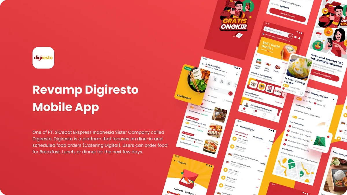
Digiresto lets people pre-order breakfast, lunch or dinner days in advance: scheduled, reliable catering for busy individuals and organisations. As Digital Catering grew into the core of the business, the experience had to become more usable, more useful and more scalable.
02 · Problem
Three places where users got lost.
- 01Value not communicatedThe homepage didn't tell new users what Digiresto offers (scheduled meals and Digital Catering), weakening first impressions and conversion.
- 02Hidden delivery optionsUsers skipped past delivery type, date and time and went straight to food, missing the scheduling step entirely.
- 03Low multi-merchant successUsers favoured “Buy Now” over “Add to Cart”, so orders rarely combined menus from multiple merchants.
03 · Process
Three homepage concepts, tested with users.
We ran usability tests from 11 to 13 March 2022 with three alternative homepage concepts, measuring success rate through the Digital Catering flow and missed clicks along the way.
- 01Promo banner pulls people inThe banner caught attention and worked as an entry point for exploration.
- 02Core offering is understoodMost users already recognised Digiresto as a Digital Catering platform.
- 03“Top Brand” didn't landThe top catering brands section drew little engagement compared with actionable content.
04 · Solution
Catering first, with a premium feel.
- 01Revamp the homepageLead with Digiresto's value so users understand the platform at a glance.
- 02Enhance the catering flowClearer visuals and flow from browsing merchants to purchase.
- 03Simplify catering ordersEasier delivery type, scheduling and multi-item checkout.
Alt Design 1 won the test. The new homepage guides users straight into Digital Catering and gives the food a premium (“mewah”) presentation, with a clearer hierarchy and focused pathways.
05 · Outcome
Catering-flow test: solid scores, room to refine.
- 8.4ease of flow (/10)
- 8.4information clarity (/10)
- 8.5UI design (/10)
- 8.5overall satisfaction (/10)
In usability testing of the Digital Catering order flow, most participants completed their orders smoothly and rated it positively. The scores show the experience works and appeals; flow clarity and information delivery are the clearest places to improve next.
Recognition
Made by a team.
- Head of DesignTundra Prihantiko
- Product ManagerBrian Ridwan
- UX ResearcherIvan Yoshua
- IllustratorMujahid Alawi
- Motion DesignerAndri Wiranuari
Next project