Case studyDesign system · SiCepat Ekspres
Gezit Design Language System
One design language for every SiCepat product.
- Role
- Product Designer
- Company
- SiCepat Ekspres Indonesia
- Scope
- UI components · Design system · Testing · Maintenance
- Team
- Head of Design + 11 credited collaborators
- 84.584.5SUS score, above the 68 benchmark
- 30%30%less design time, at most
- 16m 50s16m 50ssaved per designer on average (max 38 min)
- +4.8+4.8consistency score on page 1 (34.2 → 39)
01 · Context
One of Indonesia's largest logistics networks, with no shared design language.
Founded in 2014, SiCepat grew into one of Indonesia's largest logistics companies by 2021. As its digital products multiplied (customer apps, partner dashboards, internal tools), each team drifted into its own look, feel and behaviour. There was no unified system to guide design or engineering.
- 35M+transactions
- 1M+Android downloads
- 17,000partners
- 740+service points
02 · Problem
Five problems, one root cause: no single source of truth.
- 01Inconsistent designEvery designer brought their own style, so the same action looked and behaved differently across apps.
- 02Collaboration gapWithout a shared reference, designs were interpreted differently in build, causing delays and rework.
- 03No documentationTeams hunted for assets and asked the same questions; knowledge lived with individuals.
- 04No reusable componentsEvery button, form and layout was rebuilt from scratch, product after product.
- 05Difficult onboardingNew joiners had no standard to learn from, so they duplicated work and diverged.
03 · Process
Built as a product, not a side project.
We adopted Nathan Curtis' Cyclical team model: a central design-system team plus a federated group of contributors, each informing the other. Everything lived in Figma: a UI pattern library for designers, hand-off specs for engineers, and documentation anyone could read.
Foundations came first (colour, typography, spacing and iconography), so every component would inherit the same decisions.
A UI audit clustered screens across the ecosystem, merged duplicates (four button styles became three) and ranked components by usage and impact. A naming convention (component / class / type / state) and Atomic Design kept the library searchable.
04 · Solution
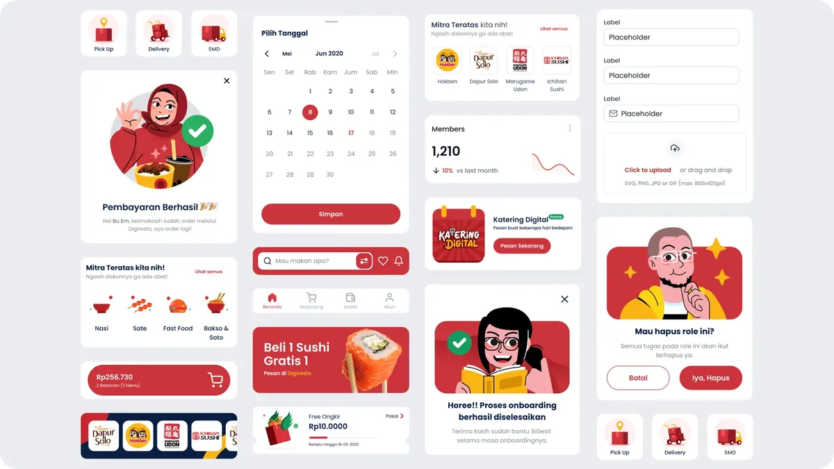
A component library for mobile and web, plus an illustration system.
Gezit shipped as reusable, on-brand components for both platforms, tested and refined before landing in SiCepat products. An illustration system covers storytelling: pick from the Figma library, or request a new illustration, wording or Lottie through a form.
05 · Outcome
Faster, more consistent, and designers said so.
Before launch we validated the system with five product designers: each designed the same pages twice, once without the DLS and once with it, followed by interviews and a System Usability Scale questionnaire.
“Easy. Just drag & drop, find the component and pick the variant. The biggest help is time.”
“With the DLS the design looks better and neater.”
“Spacing, layout and margins are already provided, so I don't have to think about them.”
Next steps from the study: align component names with how designers think, add variants for product identity, and track DLS satisfaction quarterly. Components were then deployed into the shared engineering library with the engineering team.
Recognition
Made by a team.
- Head of DesignTundra Prihantiko
- Product DesignersDanang Dwi, Theresia Karina, Nanda Febrian Adhi, Muhamad Fadli, Raka Caesar, Arief Bagus
- UX ResearchersGabriella Dian, Ivan Yoshua
- UX WriterFadhila Auliya
- IllustratorMujahid Alawi
- Motion DesignerAndri Wiranuari
Next project