ShowcaseDocumentation · SiCepat Ekspres
Gezit Website
The single source of truth for SiCepat's design language.
- Role
- Product Designer
- Company
- SiCepat Ekspres Indonesia
- Scope
- UX design · Prototyping · Detailing
- Audience
- Designers · PMs · Brand · Engineers · Vendors
01 · Overview
One home for foundations, brand and components.
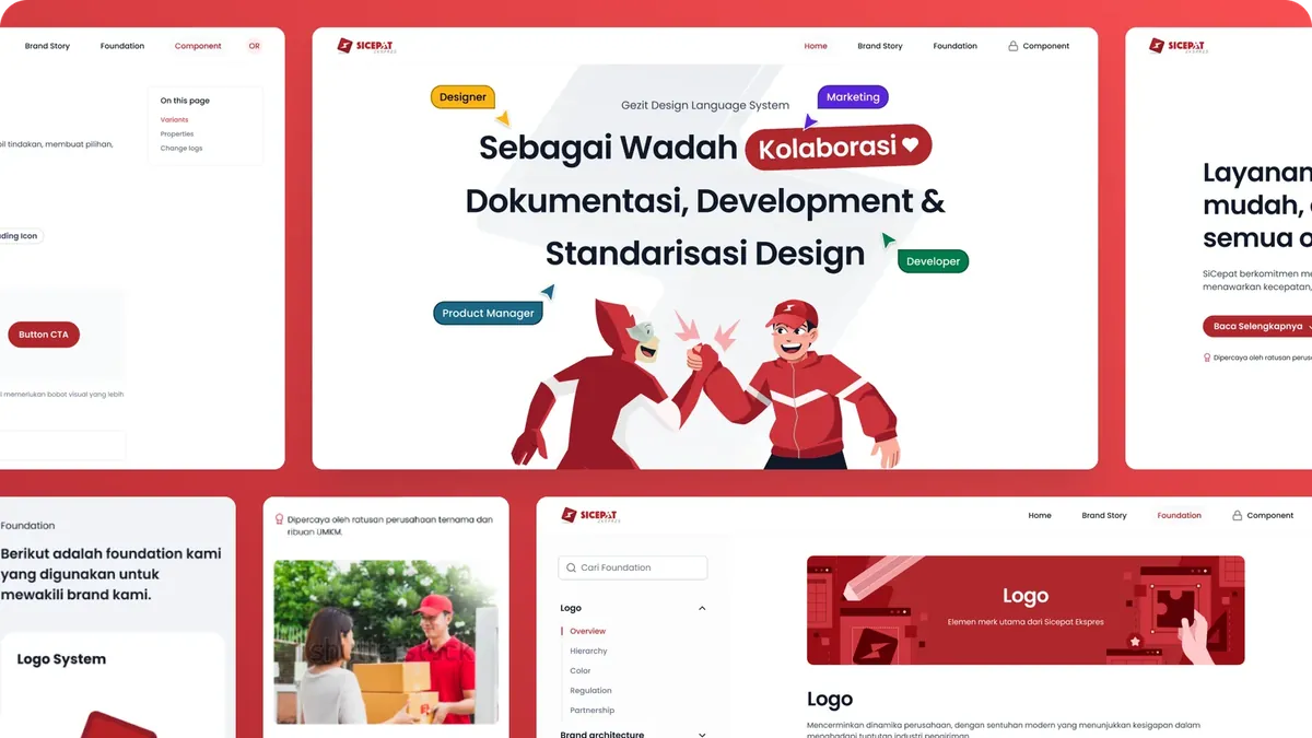
The Gezit Website is the official documentation hub for SiCepat's Design Language System. It centralises Foundation, Brand Story, the Component Library, usage guidelines, visual tokens and best practices, so every team building under the SiCepat brand works from the same source.
It serves product designers, product managers, brand marketing, engineers and external vendors alike: whether you're shipping a new feature, scaling a product or onboarding a team, the answer lives in one place.
- Foundation
- Brand Story
- Component Library
- Usage guidelines
- Visual tokens
02 · Homepage
A front door that invites people in.
A hero banner drives exploration, a short brand story shares SiCepat's values, and quick links lead straight into Foundation: logo system, iconography, typography, colour, spacing and grid.
03 · Foundation
Do's and don'ts for every core asset.
Logo, brand architecture, colour, typography, iconography, illustration style, grid and spacing, each with clear guidance and examples of what not to do, so internal teams and partners stay on-brand.
04 · Brand Story
Ten years of SiCepat, told through its work principles.
- 10years of SiCepat
- 38provinces
- 740+service points
The page introduces GESIT (Gigih, Etos Kerja Unggul, Sepenuh Hati Melayani, Integritas, Teamwork), SiCepat's core work principles, and sets the tone for the whole system.
05 · Component
Every component, documented the same way.
- 01OverviewVisual preview and the job the component does.
- 02VariantsVisual and behavioural styles of the same component.
- 03PropertiesSize, state, alignment and other options.
- 04ChangelogUpdates, improvements and breaking changes.
- 05Usage guideDo's and don'ts and implementation tips.
Recognition
Made by a team.
- Head of DesignTundra Prihantiko
- Product DesignerNanda Febrian Adhi
- IllustratorMujahid Alawi
- Motion DesignerAndri Wiranuari
Next project